Vodafone
Roaming


Research, analysis, product design, user-testing
Vodafone Turkey, with 25 million users, is a leading telco serving all age groups. Approximately %20 of Vodafone Turkey's users travel abroad, with a significant portion doing so during the summer months. These users frequently rely on the Vodafone Yanımda app for information, showcasing the app's critical role in supporting customers' roaming needs.
Problem Statement
Travelling abroad is a key journey for telecom users, but the existing experience lacked clear and accessible information. Users struggled to understand costs and packages, leading to confusion and frequent calls to the call center.
To address this, I took over the project after the previous designer left. First, I reviewed existing user research findings, which revealed that users struggled to understand package details and lacked confidence in their purchases. The product itself was also problematic, as some packages were identical for different countries, creating unnecessary complexity.
Solution
I collaborated closely with stakeholders and product owners, pushing for changes to the product structure. For example, I convinced the team to combine redundant packages into a single offering, simplifying the options for users. I also redesigned the app's roaming journey, focusing on clear and personalized information cards.
Final design
clear, efficient, seamless
Constraints
The products were structured similarly, making it challenging to display them differently in the UI. Since they were treated as the same product on the backend, it presented a significant challenge for me as the designer. I had to collaborate closely with the backend developers to create unique identifiers for each package, allowing me to distinguish them clearly for the user.
To overcome technical constraints, I worked with solution designer to create a backend solution using Excel-based data integration, which allowed us to deliver the improvements on time.
A key constraint was the summer travel period, which increased user demand for roaming information and required a quick, scalable solution.


Research
Understanding the abroad experience
First, my main focus was understanding the user. I analyzed the current roaming experience, which was co-created with Vodafone Group, but realized that the Turkish market has different products and user habits, making localization essential.
To gain deeper insights, I researched online complaints about the roaming page and used the Pivony tool for additional data.
User research findings helped me identify key pain points, such as confusion about roaming costs, a lack of clear information, and a high volume of call center inquiries. This emphasized the need for a more localized, intuitive solution to enhance the user experience.
Old design (pre-redesign)
Lack of information, complex steps, not to the point
Research
Real user
There was a user research findings before I joined the responsible squad. I worked closely with the user research team to dive deeper into these findings.
What users say?


Explore
Product & Experience
Quick Wins Part I and Part II After reviewing research, call center feedback, and analytics findings, I identified a solution to quickly address some customer issues. Since the addon process required lengthy backend development, I focused on resolving immediate pain points that could be tackled faster.
Quick wins part I: The "other operators" section was leading to confusion, so I removed it to simplify the experience.
Quick wins part II: UX writing was updated to provide clearer, more straightforward information.
Quick wins
the 'other operators' section was removed, and the UX writing was changed
Explore
Workshop
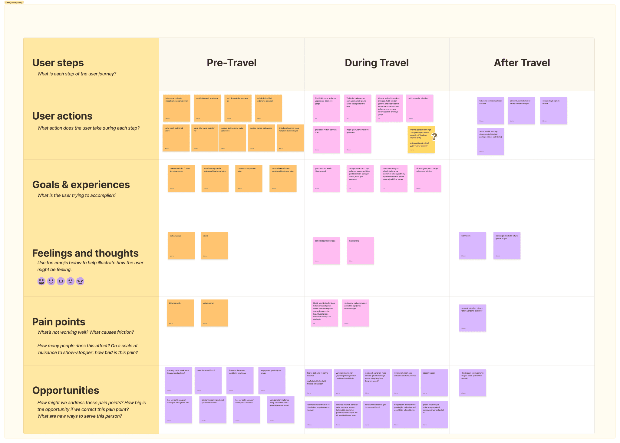
I conducted a user journey workshop with the product team (product owner, product leads) to gain a deeper understanding of the user experience during their travels. I divided the experience into three parts and together, we identified the challenges users face at each stage. We also discovered opportunities that could be addressed both immediately and in the future.
Explore
User flow
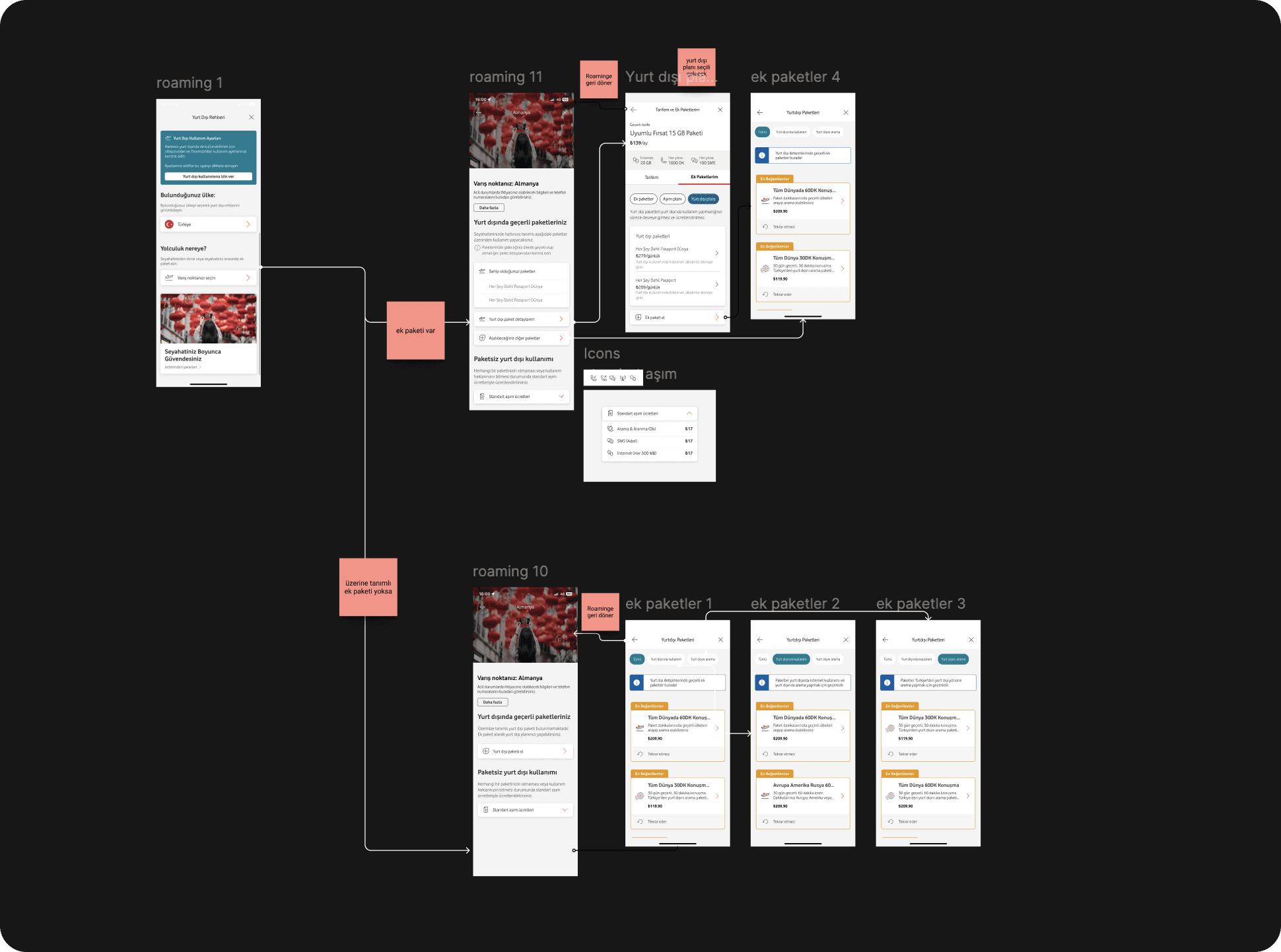
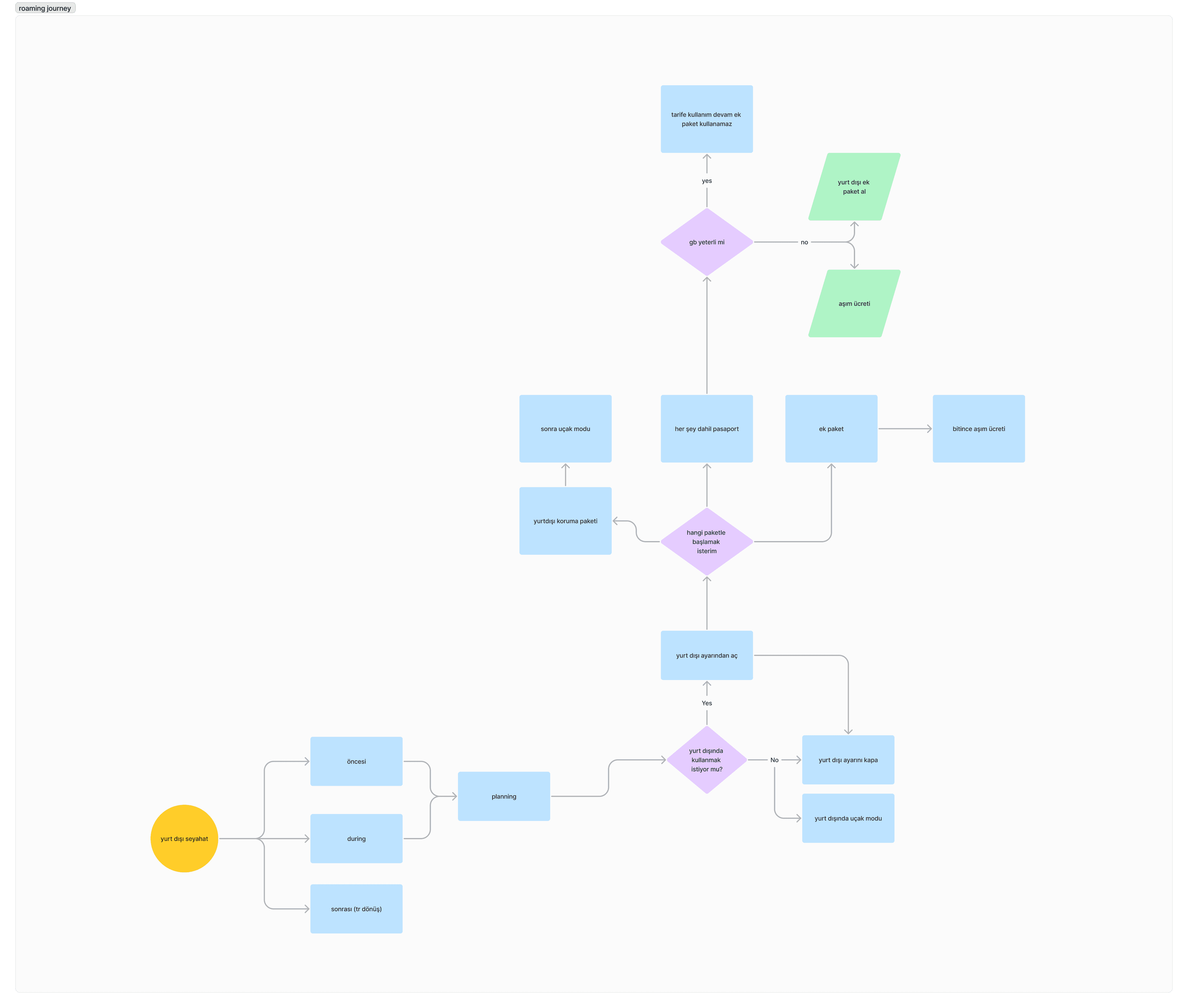
After the workshop, I created a user flow, breaking it down into three stages: pre-travel, during travel, and post-travel.
First sketches
Wireframes
I created a user journey map with pre-travel, during travel, and post-travel stages. After our analysis, I realized that adding the post-travel stage wasn't necessary, as users needed to see how their bill changes afterward. However, since we didn’t have that information directly, adding it would only repeat what was already covered in the before and during stages.
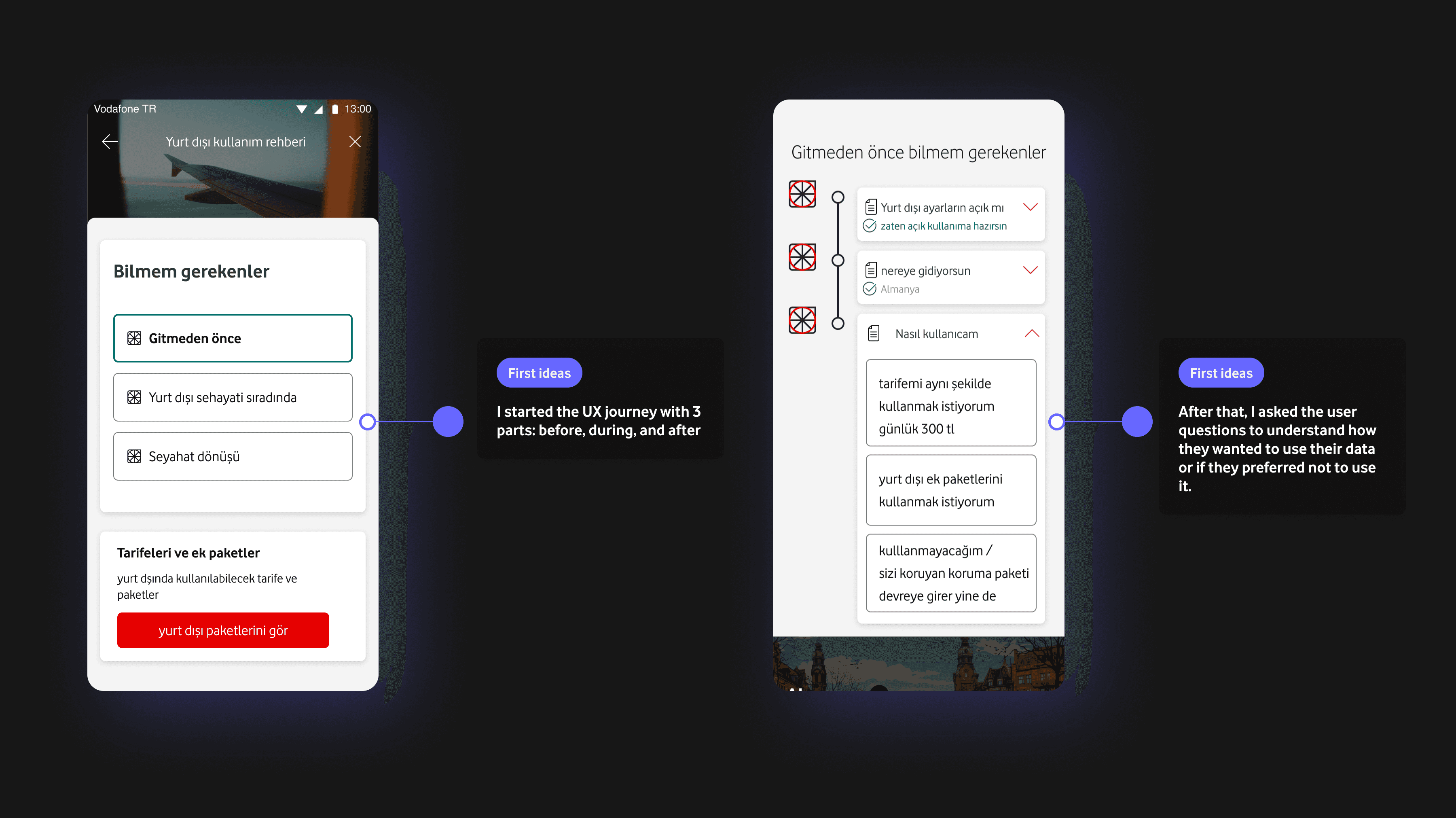
First sketches
Wireframes
With that being said, I realized that I wasn't providing users with a different experience when they selected the before or during options. I was essentially just adding one more step without delivering additional value.
Finalization
Final experience decision
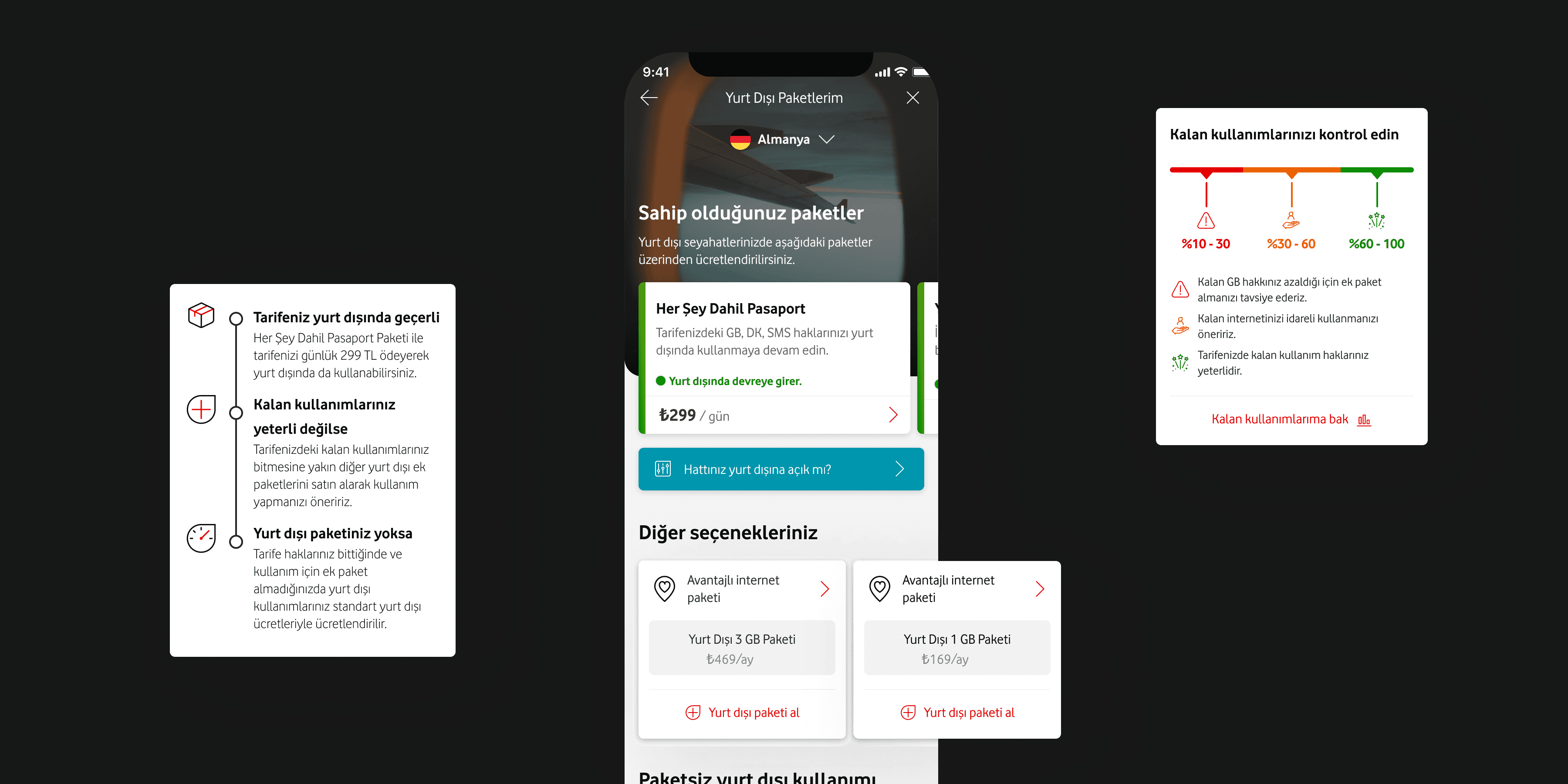
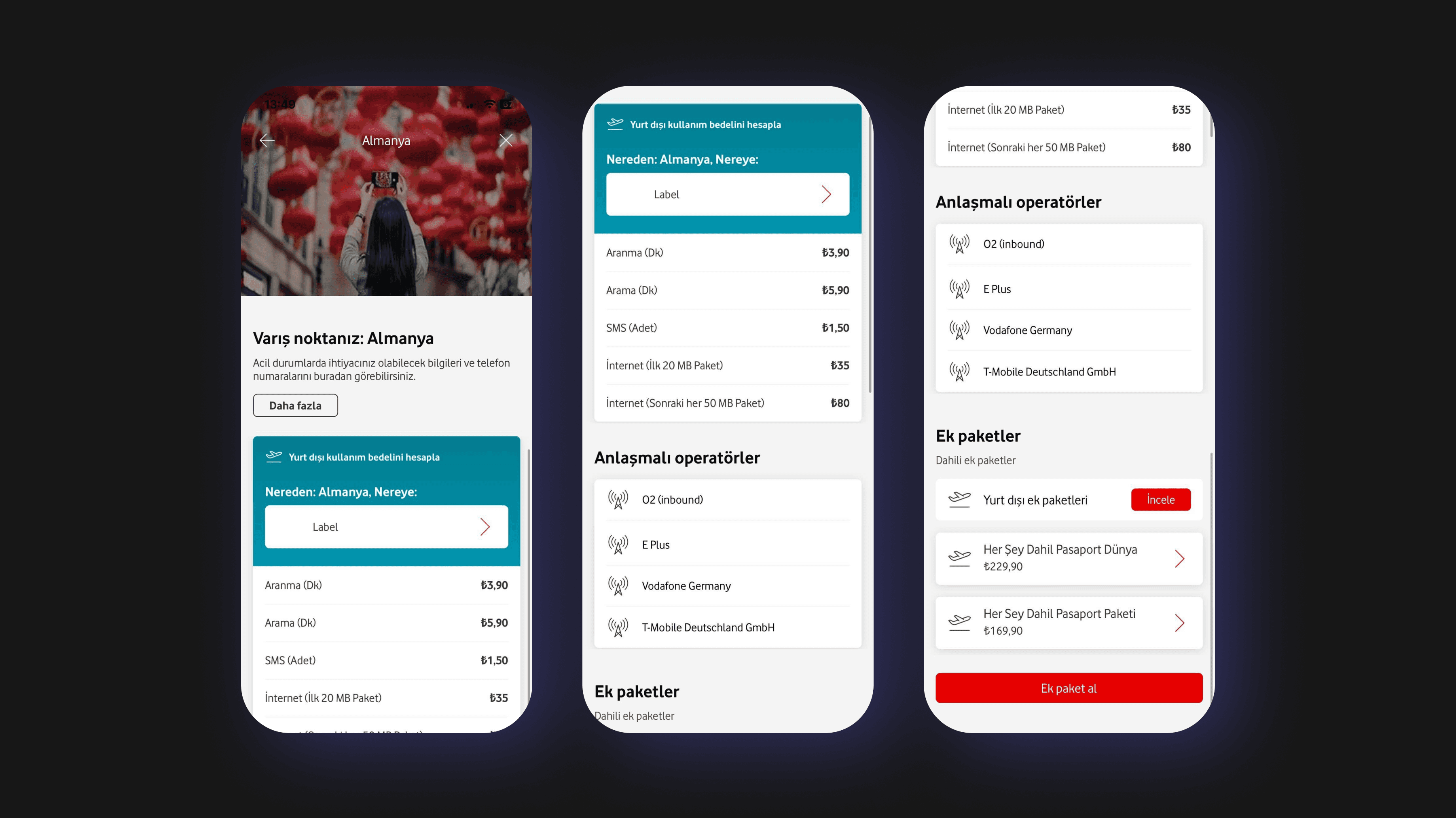
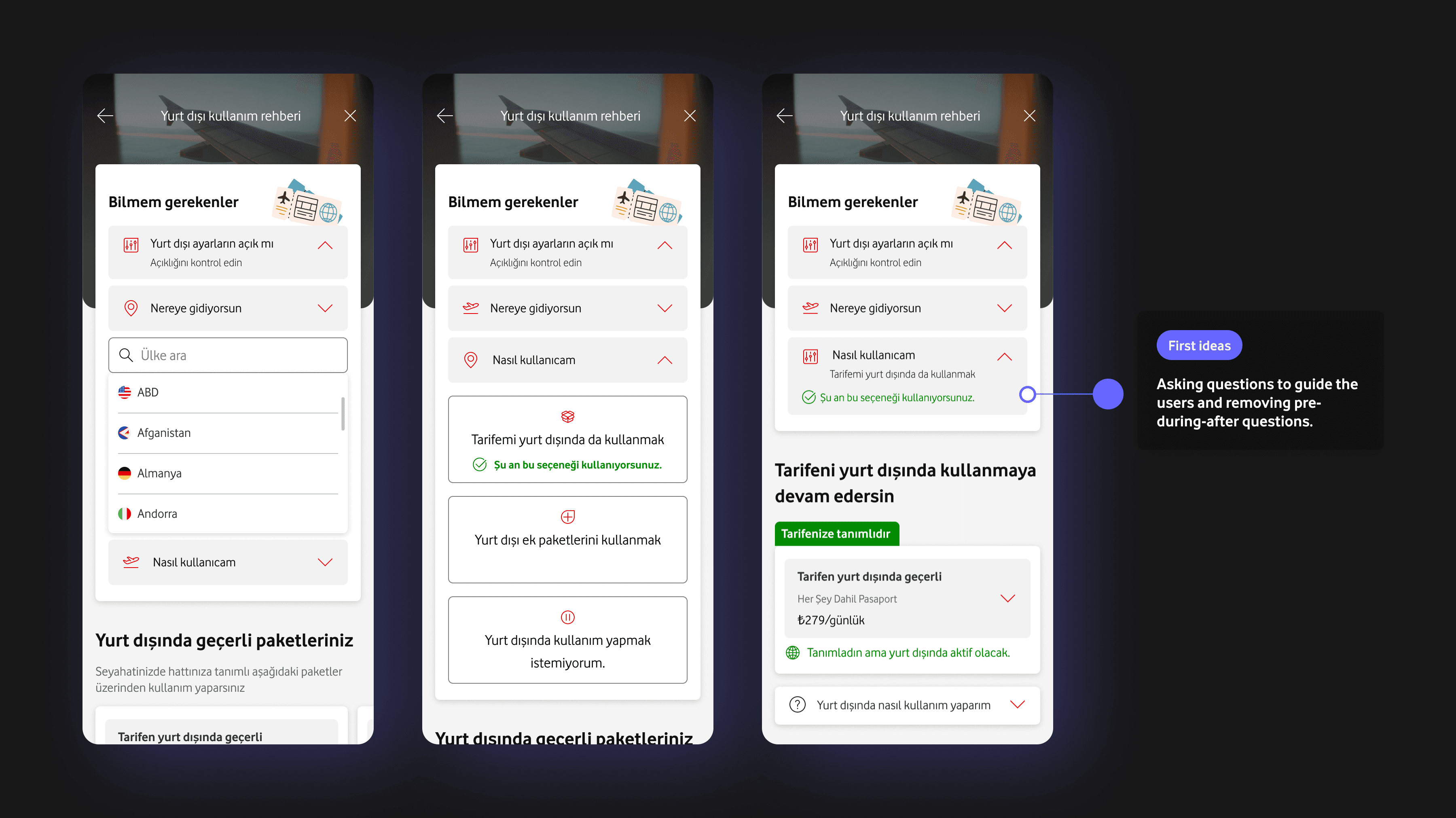
I finalized the experience in a simpler way because I realized I was adding unnecessary steps. It’s okay to add steps if they enhance the experience, but that wasn't the issue here. So, the final product now allows users to easily see what they currently have and what they might have. The product detail page provides them with all the necessary information to make informed decisions.
Prototype
Final experience
To the final
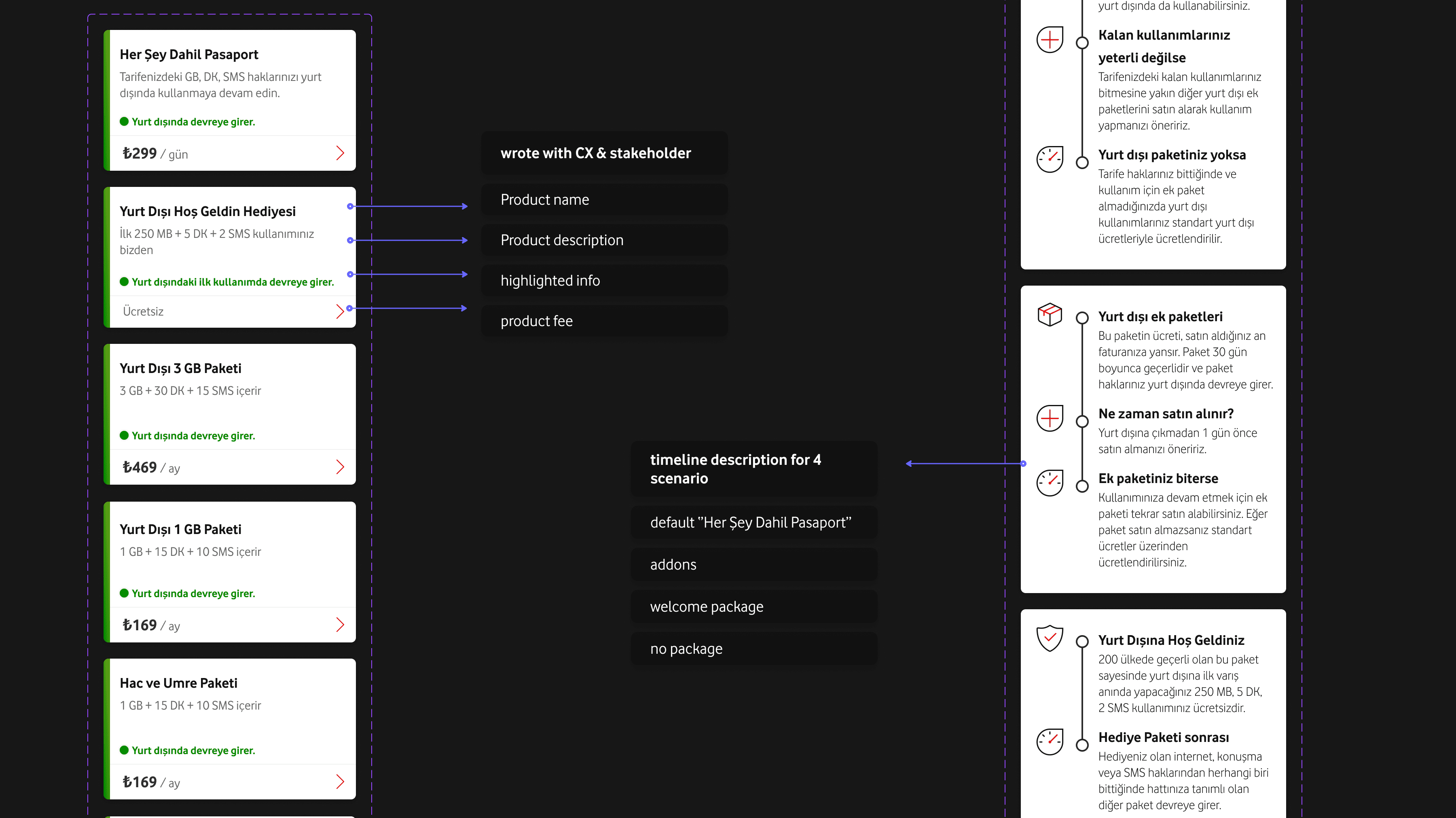
It is all about the details
It was time to focus on the card details to ensure consistency across the experience. I also aligned the design with our design system to maintain uniformity in typography, colors, and component usage, ensuring a cohesive look and feel throughout the app.
Details
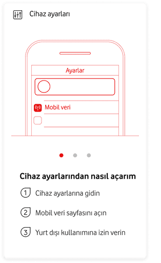
What should users do?
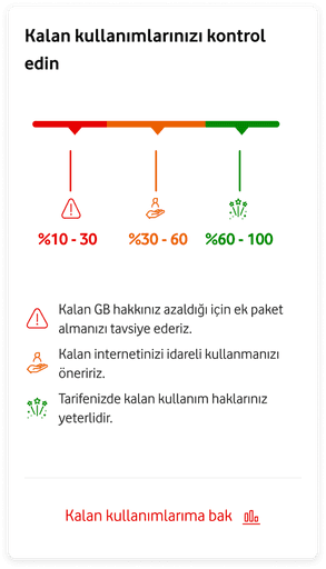
The cards help users track their usage, preventing overage and unexpected bills while abroad. They clearly display relevant information, keeping users informed and in control of their roaming expenses.
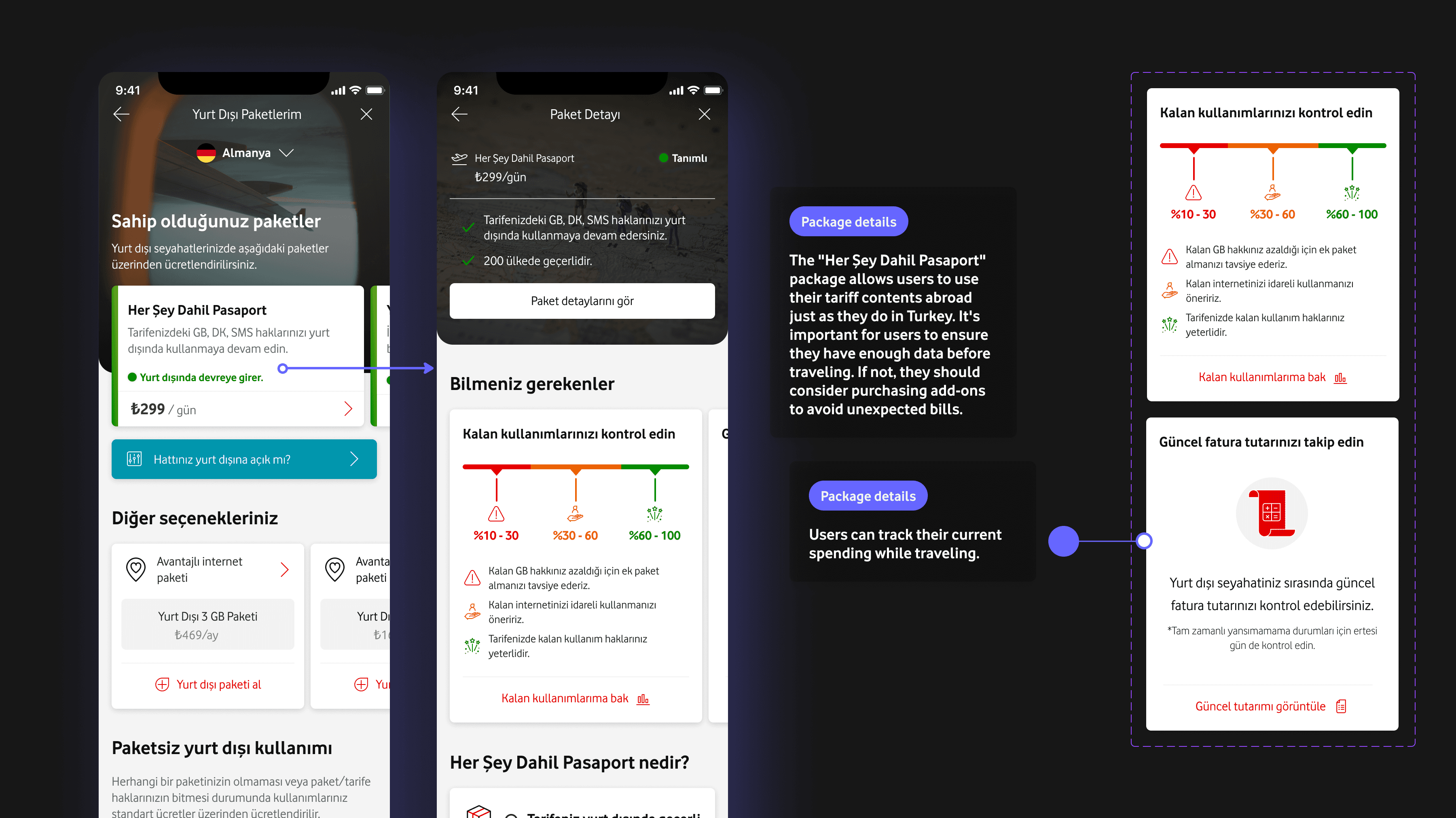
Guidance
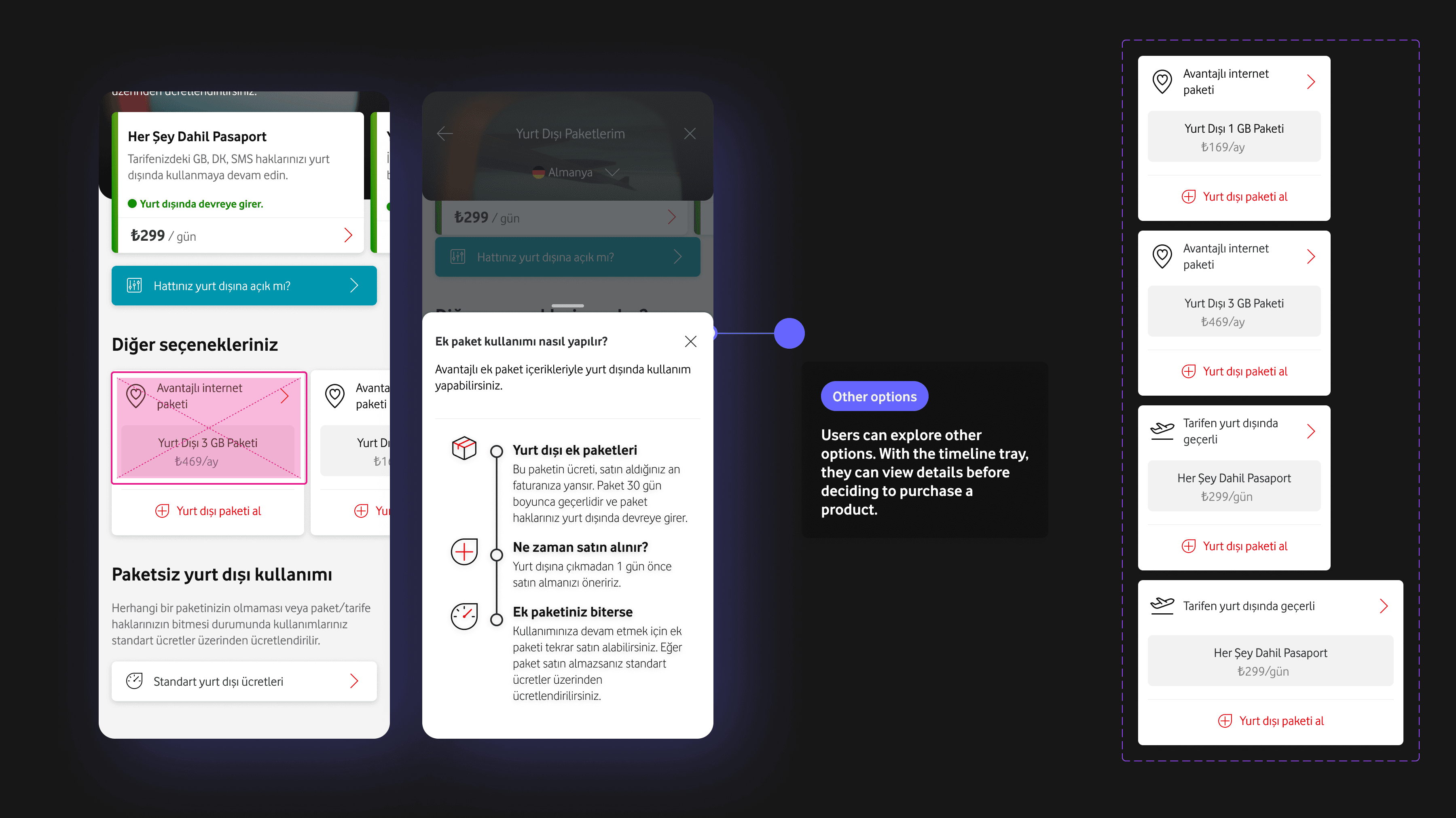
Other options
Users can see other options and understand how they can use them to manage their roaming usage effectively.
Takeaways
It is all about simplifying
As a result, the redesign led to a persistence, %20 reduction in call center inquiries related to roaming, as users could now easily find the information they needed directly in the app. This project taught me the importance of persistence, cross-team colloboration, and balancing design improvements with product changes to achieve impactful results.
%35-
%35-
call center inquiries
%30+
%30+
addon sales