Allianz
Internal Rate
of Return
Research, analysis, UX design
Allianz
Overview
The existing design of the IRR (Internal Rate of Return) feature for users' private pension plans was causing confusion, as they struggled to understand their yearly income. This was a project I worked on during my time at agency, with Allianz as our client.
I took ownership of the redesign project, ensuring a user-centric approach. Our goal was to create a clear and intuitive interface that allowed users to easily view and compare their income against other parameters such as inflation and foreign currency. This redesign improved user experience by making financial data more accessible and comprehensible.
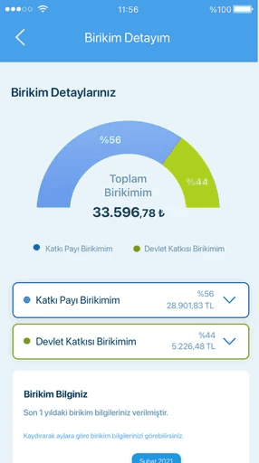
Old design (pre-redesign)
No comparison, no details
Challenge
A challenge I faced was understanding the product, as it was a client project and I was working in an agency environment, which required more effort than a typical corporate setting. To quickly grasp the product and its complexities, I participated in a series of rapid, intensive workshops with the client. These sessions not only provided essential insights but also helped establish a shared understanding of the product benchmarks, enabling us to proceed efficiently with the redesign project.
Process
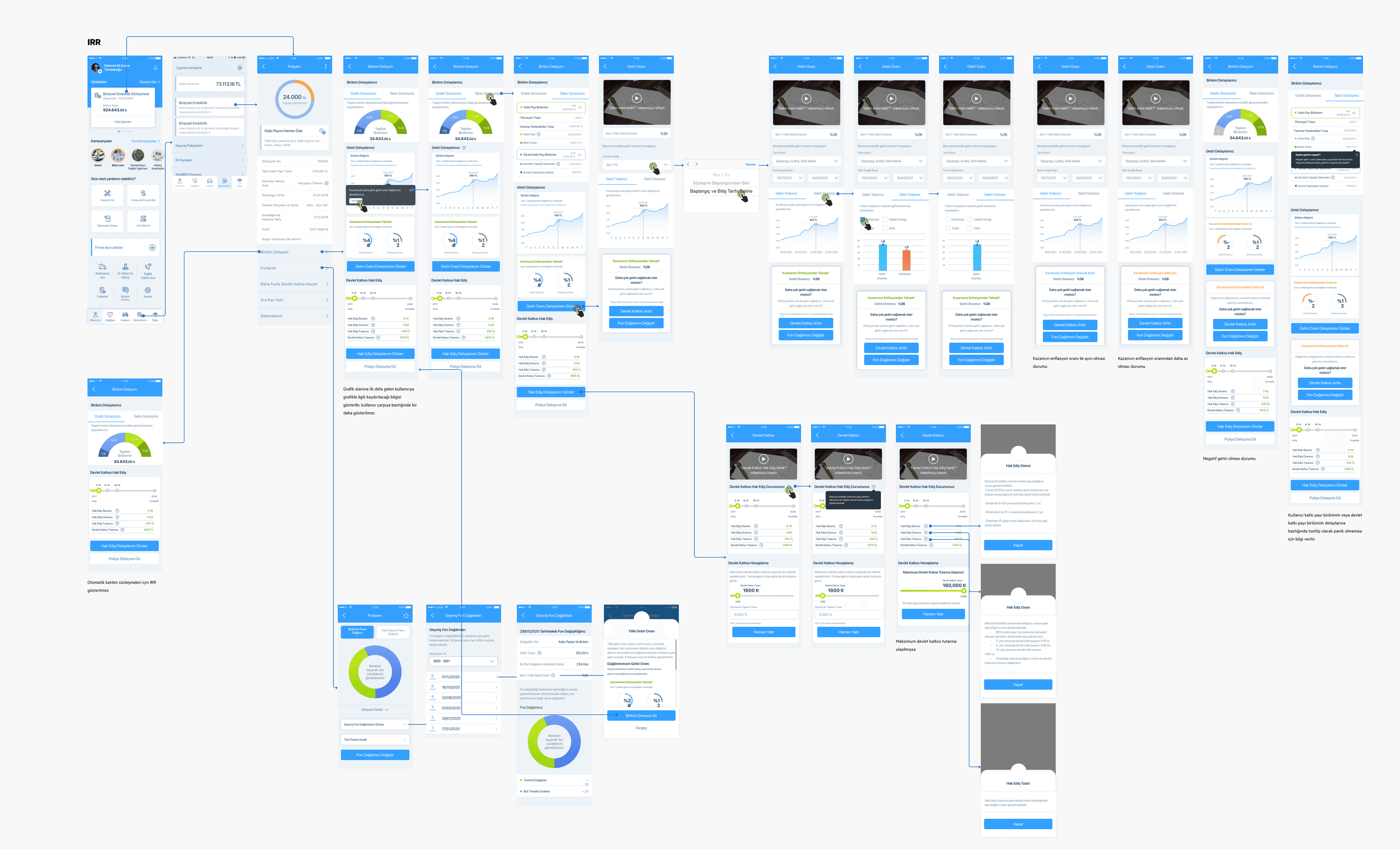
After deeply understanding the product, it was time to sketch, sketch, and sketch some more. After exploring various alternatives and incorporating client feedback, the design began to take shape. Now, it was time to understand the users’ perspective and ensure that the solution I had designed truly addressed their needs.
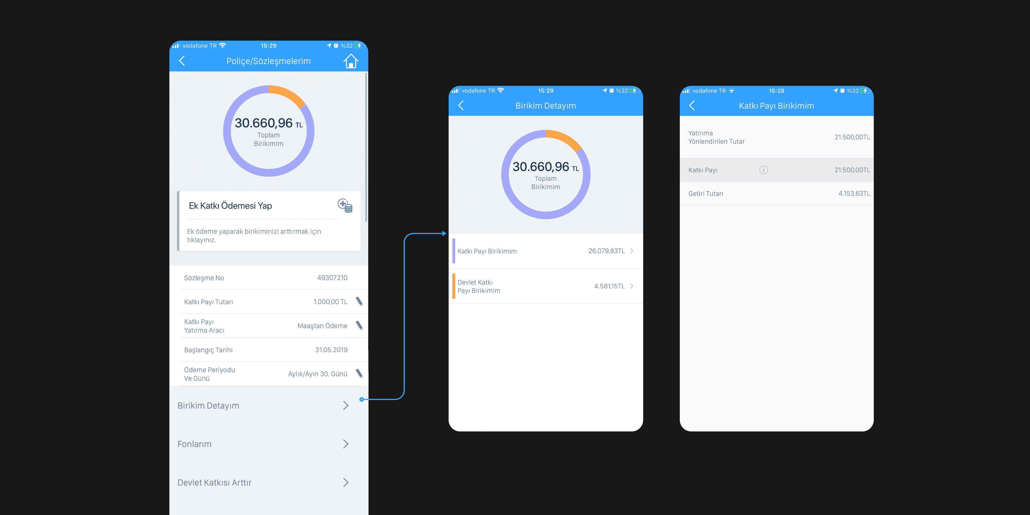
I created a detailed flow that served both the client and developers. Since it was a client project, I ensured to provide comprehensive documentation for the final product, ensuring clear communication and alignment at every stage.
What users think?
I conducted user research with 8 participants, representing 3 different user types, to understand their reactions to income comparisons at low, equal, and higher levels, in relation to inflation. This helped me gather valuable insights into how users perceive and interact with financial data under different conditions.
Prototype
for moderated usability testing
Scenarios
When their yearly income was lower than inflation, it was important to establish transparent communication to prevent users from panicking and help them remain engaged with their portfolios.
Research actions
After conducting research, it was time to enhance the experience.
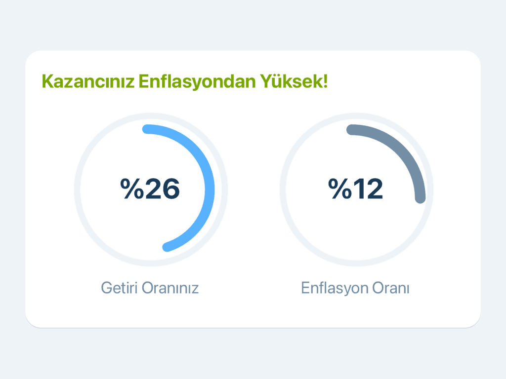
Higher
The yearly income from users' private pension plans is higher than inflation.

Equal
The yearly income from users' private pension plans is equal to inflation.
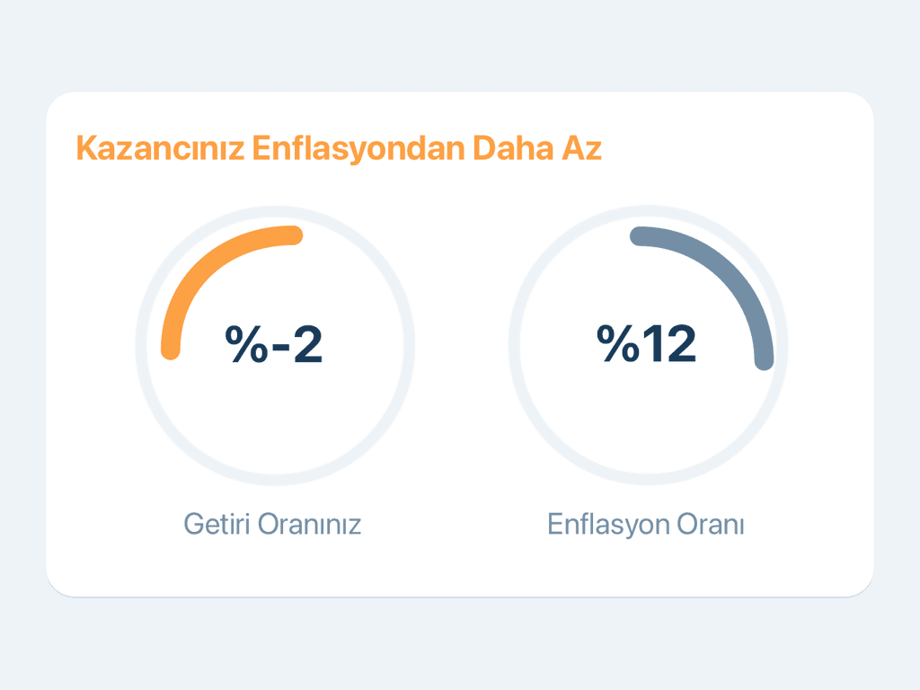
Lower
The yearly income from users' private pension plans is lower than inflation.
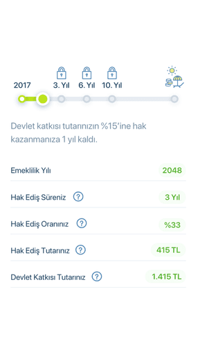
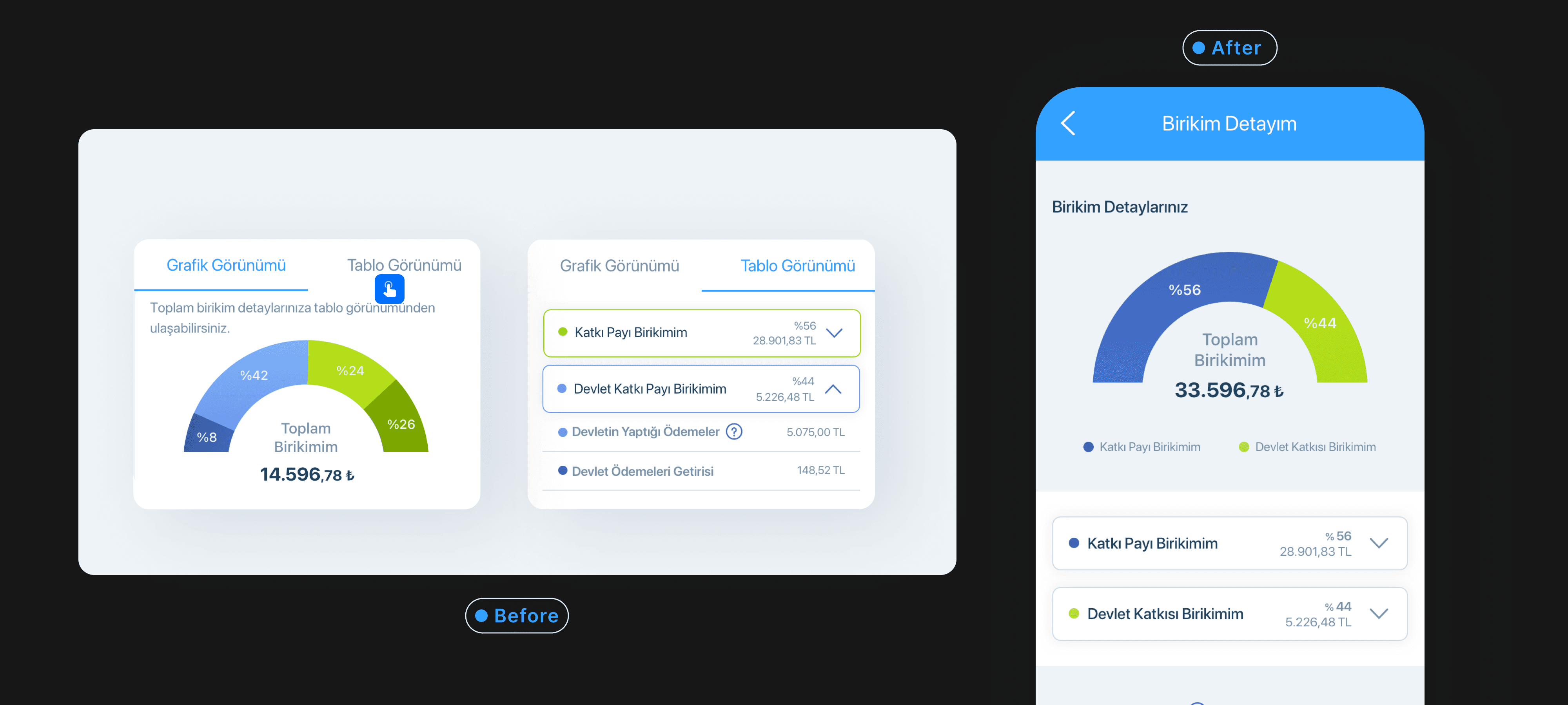
#1 Simplifying portfolio data visualization
From confusion to clarity
Before the research, the decision I made was for users to see the graph first and then view the details within a second tab. The first page would serve more as a summary, with minimal scrolling required. However, after conducting the research, it became clear that users' main focus was on understanding their portfolio. Additionally, 75% of users found it hard to understand the pie chart. The separate tabs made it difficult for them to connect the information. Therefore, I combined the graph and table components so users could easily read and understand the data in a more intuitive way.
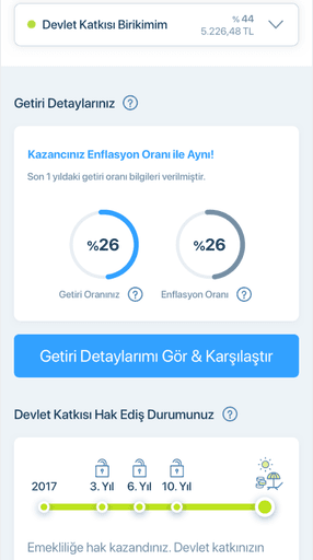
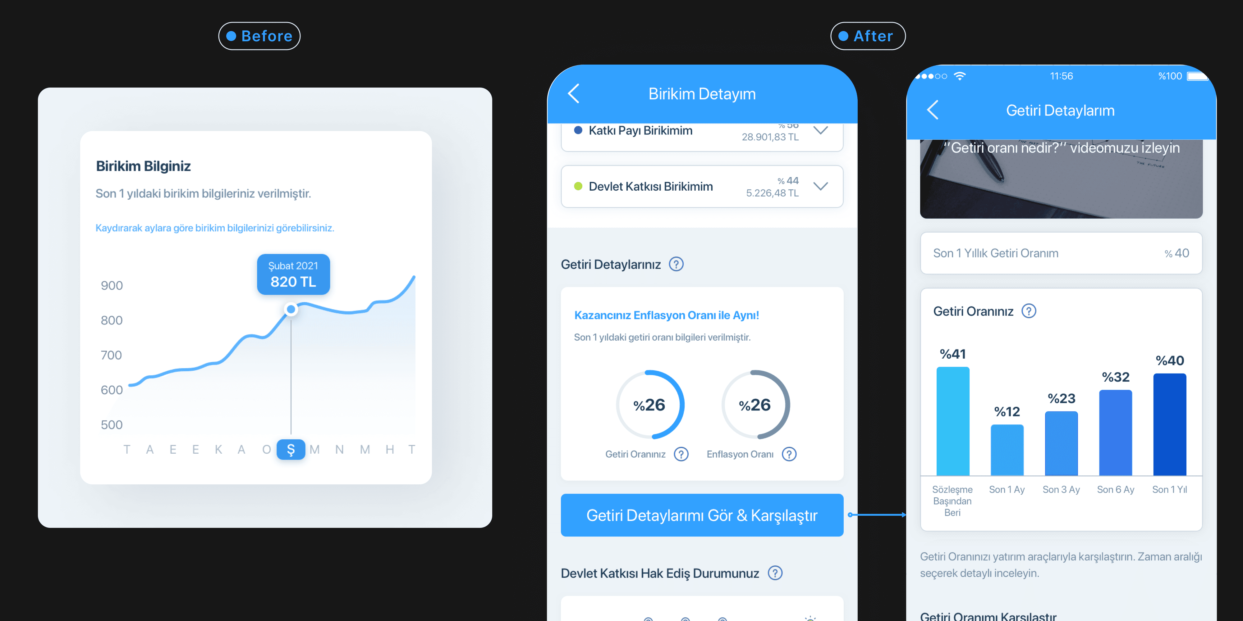
#2 Enhancing graph clarity
Shifting from monthly to key time periods
I observed that participants who think long-term about the private pension plan have low motivation to examine the monthly return details. Based on this insight, I replaced the month-to-month line graph with a column chart that focuses on the most important time periods, according to user research. For the private pension plan, users can now view the last 3 months, last 6 months, last 1 year, and from the beginning of the investment.
#3 Users' favorites
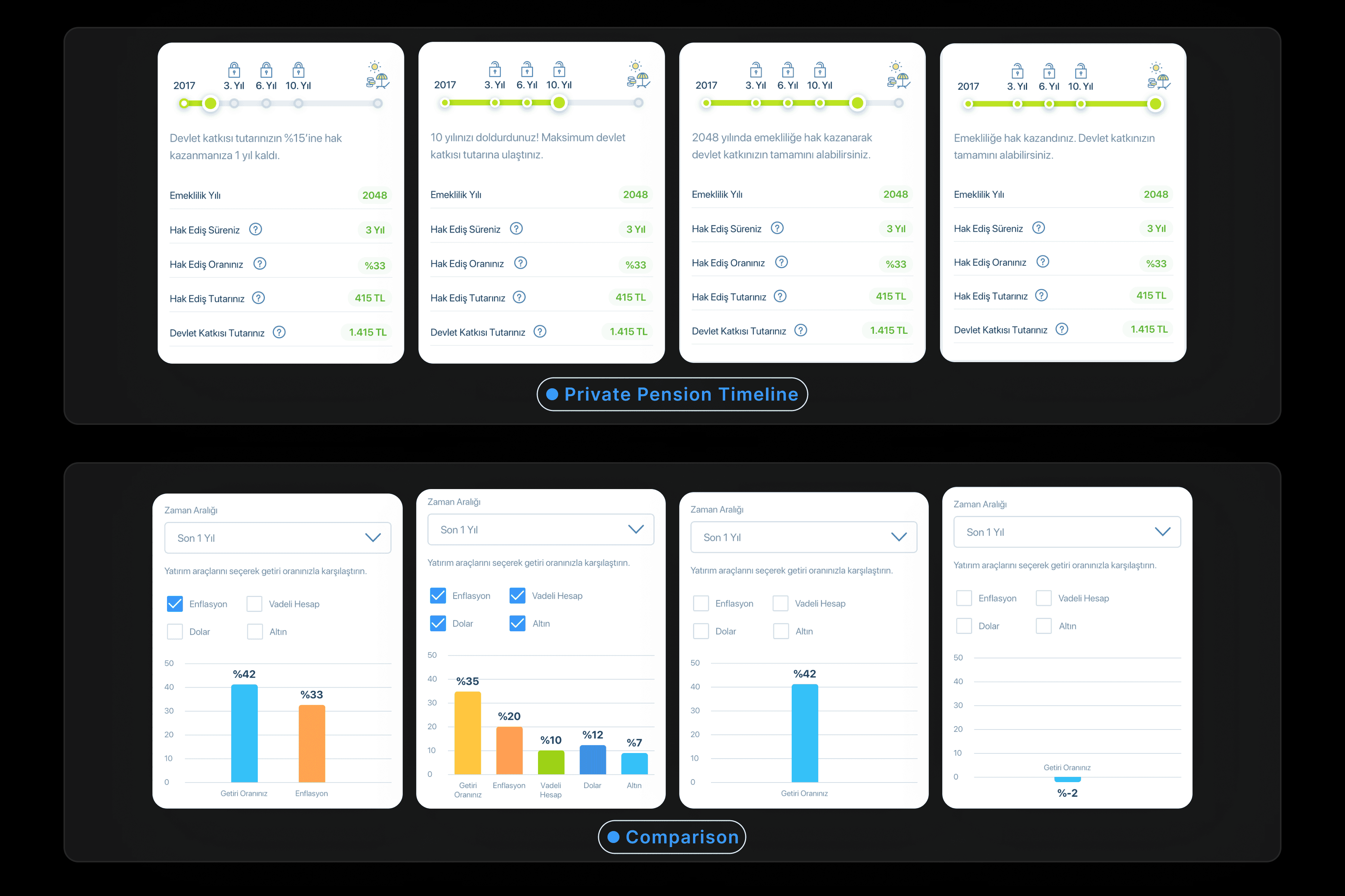
IRR features that stand out
According to the user research, the strong features of the IRR were the private pension timeline and the comparison feature for other currencies. Users found the private pension timeline clear and informative, stating that they understood when they would receive their government contribution payment. The comparison feature, which included not only inflation but also other parameters, was also viewed positively by the users.